Education for all people
Close
Menu

Navigation

  • 1 Year
  • 5th Year
  • Literatures
  • Portuguese Language
  • English
    • Russian
    • English
    • Arabic
    • Bulgarian
    • Croatian
    • Czech
    • Danish
    • Dutch
    • Estonian
    • Finnish
    • French
    • Georgian
    • German
    • Greek
    • Hebrew
    • Hindi
    • Hungarian
    • Indonesian
    • Italian
    • Japanese
    • Korean
    • Latvian
    • Lithuanian
    • Norwegian
    • Polish
    • Romanian
    • Serbian
    • Slovak
    • Slovenian
    • Spanish
    • Swedish
    • Thai
    • Turkish
    • Ukrainian
    • Persian
Close

Absolute frequency and relative frequency

Absolute frequency and relative frequency are two very useful concepts in data analysis and Statistic.

The absolute frequency corresponds to the number of observations in each class of a variable. The relative frequency is given by dividing the number of observations in each class by the total number of observations.

see more

Students from Rio de Janeiro will compete for medals at the Olympics…

The Institute of Mathematics is open for registration for the Olympics…

How to calculate absolute frequency and relative frequency

To really understand what absolute frequency and relative frequency mean and how to calculate, consider the following example:

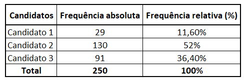
To assess the intention to vote for mayor in a certain municipality, a survey was carried out with 250 voters. There are three candidates for mayor and each voter answers which one he intends to vote for.

After obtaining the data, count how many voters intend to vote for each of the three candidates, obtaining the absolute frequency for each candidate:

  • candidate 1: 29 voters
  • Candidate 2: 130 voters
  • candidate 3: 91 voters

Dividing each quantity by the total number of voters, we get relative frequency for each candidate:

  • candidate 1: 29/250 = 0.116 = 11.6%
  • candidate 2: 130/250 = 0.52 = 52%
  • candidate 3: 91/250 = 0.364 = 36.4%

For ease of interpretation, relative frequency is usually presented as a percentage, so we multiply each result by 100%.

We can organize this data into a frequency table:

frequency table

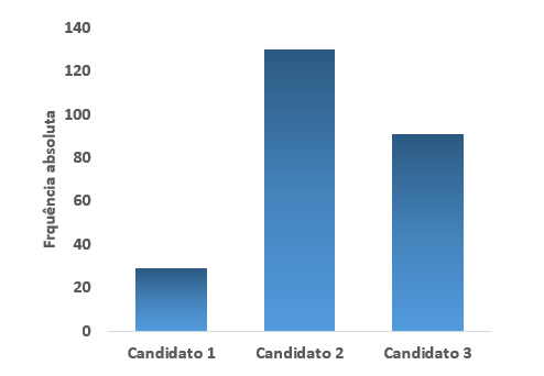
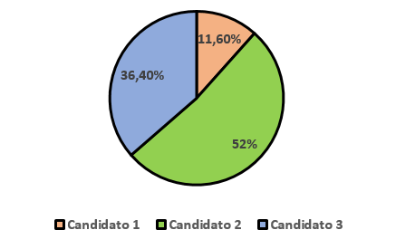
Also, for a better visualization and understanding of the data, we can use some graphics.

In the bar graph, each bar represents a class and its size indicates the absolute frequency corresponding to the class.

Bar chart with absolute frequencies

At the pie charts or “pizza”, each sector represents the class in relation to the whole, that is, in relation to the total number of observations. Generally, the relative frequency in percentage is also used here.

Pie chart with relative frequencies

You may also be interested:

  • Mean, mode and median
  • Dispersion measures
  • Standard deviation
  • List of Charting Exercises
Check out 4 unhealthy food combinations
on Jul 31, 2023
Microwave burned out and not working? See how to fix it!
on Jul 31, 2023
Extra income: Check out 3 ways to increase monthly earnings
on Jul 31, 2023
1 Year5th YearLiteraturesPortuguese LanguageMind Map FungiMind Map ProteinsMathMaternal IiMatterEnvironmentLabor MarketMythology6 YearMoldsChristmasNewsNews EnemNumericalWords With CParlendasSharing AfricaThinkersLesson Plans6th YearPoliticsPortugueseRecent Posts Previous PostsSpringFirst World WarMain
  • 1 Year
  • 5th Year
  • Literatures
  • Portuguese Language
  • Mind Map Fungi
  • Mind Map Proteins
  • Math
  • Maternal Ii
  • Matter
  • Environment
  • Labor Market
  • Mythology
  • 6 Year
  • Molds
  • Christmas
  • News
  • News Enem
  • Numerical
Privacy
© Copyright Education for all people 2025