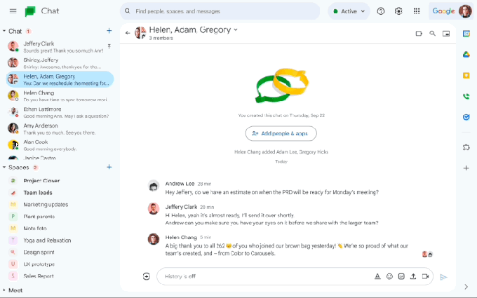
O Google updated your chat to look like other functions. Now, Gmail, Slides, Drive, Docs, Sheets and chat will follow the same branded design, Google's newest Material Design 3. The new interface included round shaped buttons, a rounded search bar and other details in blue.
Google's Design 3 presents a clean, subtle and sophisticated proposal, with new formats to guarantee a small – and significant – change in the look of the chat. In addition to the appearance, other changes are clear in the user's main message, in the direct messages panel, in the message configuration and in the icons on the right.
see more
IBGE opens 148 vacancies for Census Research Agent; see how…
Published law establishing the 'Program for the Acquisition of…
This week, the company also announced a new tool for chat by allowing users to space managers can create the environment just for ads, optimizing the use of the environment. This, then, is the biggest of the updates.
This ad space, as Google intended, is a way to dedicate the moment specifically for this, preventing the user from having to search through many conversations for what he could find easily. In the GIF below, released by Google itself, there is a small preview of the new update.

In design, the change can be totally predictable, since other environments in the company have already presented the change. The optimization of rounded spaces presents a subtle, sophisticated and modern feature.
The main update announced is aimed at managers and ads at least for now. We look forward to the updates that are planned to be released gradually while the product is not released.
At any sign of change, know that it was already foreseen by Google and it is not just a sweet illusion. From the next few days, users will be able to observe small changes over the days.
Lover of movies and series and everything that involves cinema. An active curious on the networks, always connected to information about the web.

