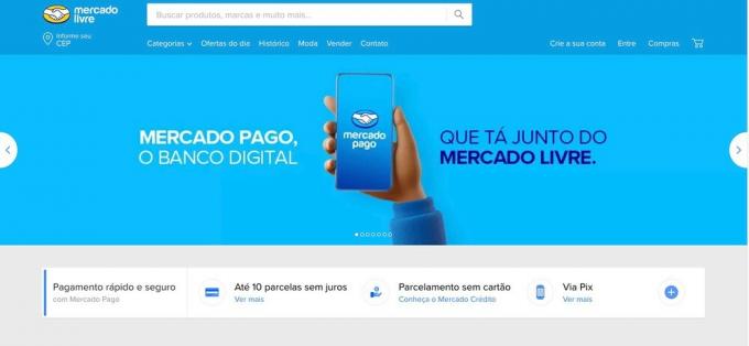
By adapting and reinventing itself in commercial strategies, the Free market surprises its customers once again. After 23 years with the same color, the brand's website was seen in blue during last Saturday, 11th, in the morning. In the pandemic, with social distancing, the company logo is no longer holding hands.
see more
Company launches the 1st "flying saucer" for crew members; meet…
Mercury entered Leo; find out how it will impact your sign
The clasped hands were undone and they turned two elbows in greeting. In respect of social distancing, Mercado Livre decided to change its logo to guarantee public reach and respect.

These strategies certainly make the platform evident in the market. This time, the color blue appears in celebration of Consumer Week and has many promotions on the site.
The online company, through the new blue color strategy, aims to increasingly show Mercado Pago as a digital bank belonging to the Mercado Livre group. The blue color refers to the digital band of the group.
Consumer Week began this Monday, the 13th, and will end on March 19th. Little by little, the commercial scene returns its expectations for this week of promotions during the first six months of this year.
For Iuri Maia, head of branding for Mercado Pago throughout Latin America, this is a moment that marks the site's history. When entering the platform and not showing everything yellow, as usual, the user realizes that there is a whole logistics strategy behind the change.
“In the coming months, we will carry out several activations that will connect us even more, always with the objective of making tangible for the users the benefits of our ecosystem", said Iuri Maia, guaranteeing that this year will be one of strategy changes for both brands.
The color blue was only on last Saturday, the 11th, from 8 am to 11 am, but the promotions will continue until the next 19th.
Lover of movies and series and everything that involves cinema. An active curious on the networks, always connected to information about the web.

