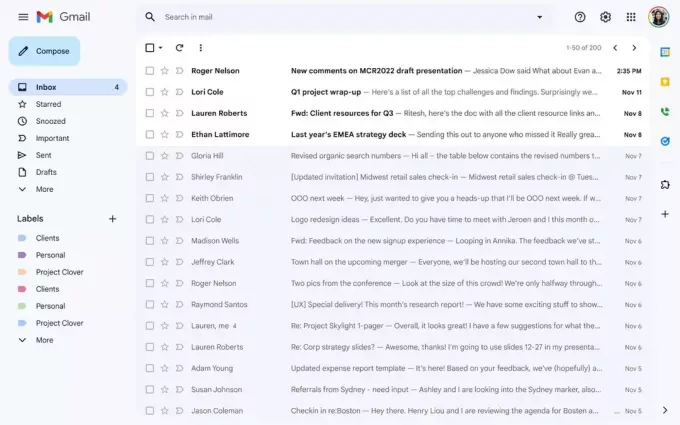
Recently, the Google started testing the Gmail's new look with some of its users. The objective is to integrate the company's main platforms, such as Meet, Chat and Space, providing more convenience to those who interact with its services. However, since February the look was optional, but since last Tuesday (28) it has become mandatory for most people.
Read more: Google Duplex: See the new function that mimics a person on the phone
see more
Low-wash: more and more people say goodbye to washing machines
Learn how to interact with Bard, Google's new chatbot and competitor…
Still, the experience shouldn't change that much, as the changes to the interface aren't that big. Some users even had some difficulty in perceiving them. If you are one of those, just look at the top left corner, where you can now see conversations with other people in a list. That way, without having to change screens, they become much more accessible.
For those who usually use Google's chat and communication services, now, with great practicality, it is possible to enter in multiple conversations in any section, even creating lists that should appear when you hover over your icon. However, for those who don't like the idea of having a chat listed below the inbox, it is possible to choose which applications will be inserted in the quick settings menu.

There, you can even change back to the old look if you prefer. The developers at Big Tech have made it clear that this is not a 15-day release for new features like the others. Rather, it's coming to workspace and personal Gmail accounts, which could take more than a few weeks for every user's interface to change on its own.
If you are very curious and can't wait any longer for the update, just open the settings menu and place the chat on the left menu. So, did you like the news? Test the new look now and see what you think.


